I'm Abigail. This is my blog for Digital Literacies.
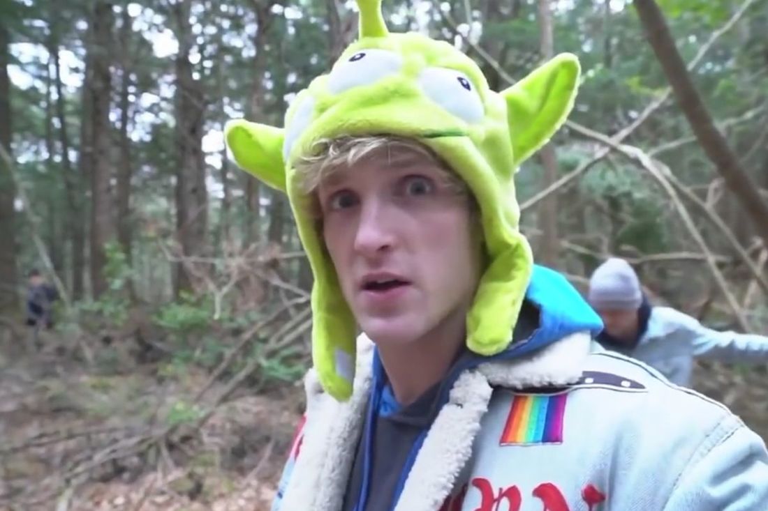 In December of 2017, Youtube sensation Logan Paul uploaded a video to the site from the Suicide Forest in Japan. In this video, he finds a man who has taken his life and decides to capture the experience on film and upload the footage to Youtube.
This event sparked massive controversy and shaming. This 23-year-old star nearly ruined his career for this video and continues to receive backlash even to this day. The controversy came about because of 2 reasons I believe: 1. His audience. Logan has a very young audience and young people are extremely impressionable. The kind of content that Logan has on his channel is all about pranking his friends and family and always attempting to one-up himself. Because of this genre of pranks and simple humor, Logan found himself doing a very stupid thing just to get views and a good laugh. 2. A lack of education. Logan has spent a good majority of his life on the internet. Most of his content does not require a college degree to understand. Because of this, I believe that Logan was seriously misinformed and therefore decided that it would be a good idea to upload the footage for the whole world to see. Logan’s mistake was a grave one. Since the mistake, his original video was taken down, but it has been reposted several times by many different sources. He has gone on to apologize several times and has even done an interview special on Entertainment Tonight regarding the incident. However, this mistake will not be covered up by a suit and a formal apology. Using a tragic incident such as this for “clickbait” and for the purpose of getting views is something that should not be forgotten. Unfortunately, Logan Paul is not the only one who has made mistakes such as this. Millions of hours of content are uploaded to the internet every day and people all over the world are making idiotic decisions just as bad as this one. The reason that this particular incident blew up was that of the author. Logan Paul has over 18 million subscribers on youtube. That type of popularity can make or break an author and for Logan, it nearly broke him. This incident is similar on some scale to the mistake made by Justine Sacco in the book, So You’ve Been Publicly Shamed. Justine’s tweet came from a place of miseducation just like Logan’s ignorance. Justine was destroyed by her unintentional racist tweet unlike Logan who’s career is seemingly still doing okay. I believe that the only way this incident could have been stopped would have been if Logan had some sort of mentor or manager that checked his content before he posted it. Creators are getting away with all sorts of things these days on Youtube and none of it is really being curated at all. So many people such as Justine Sacco and Logan Paul would benefit greatly from taking just a moment to think before posting. Due to the nature of our instant gratification culture, people blindly release content to the internet that may have been better left unposted.
3 Comments
Designing this mock-up has proven to be a slightly more difficult task than I expected. I am not well versed in InDesign and so I definitely struggled when attempting to design this page. The Logo There are three specific parts of the logo that I would like to draw attention to the skull, the sword, and the chalice. The Skull: I chose to include the skull in the logo because of the iconic scene in the play where Hamlet contemplates his existence. In the play, Hamlet stares at the skull of his childhood caretaker and realizes he must make a decision regarding his mortality. The Sword: The sword part of the logo is another crucial aspect of William Shakespeare’s Hamlet as it is one of the things that bring about Hamlet’s demise. A secretly poisoned sword that strikes Hamlet during a duel is partly the reason for his sad demise. The Chalice: The chalice in the logo is representative of the poisoned cup that Hamlet’s uncle attempted to poison him with. This is a very important part of the play because it kills Hamlet’s mother but also it shows how corrupt King Claudius truly is. The Site I chose to go with a simple layout for two reasons: The first is that I was really struggling with InDesign and I wanted to challenge myself by trying to learn it rather than using Canva or some other platform. The second is that in all of the archives I have come across, simple is always better. My main emphasis on the home page of the site is on the logo and on the slideshow of pictures. I chose this because the logo really gives a strong feeling about the content of the show, and the photos are interesting to look at and they also showcase the modern take that the director chose for this rendition of Hamlet. For the color scheme, I chose to go with a muted gray and a navy blue because those colors were utilized greatly in the show and I believe that on a website format they help to draw the eye to the content that is most important. I chose to organize the navigation bar to navigate to the six different topics that I felt would be most important to a potential audience member: Costume, Themes, the Troutt Theatre, the Players, the Score, and the Director. Overall, the project proved more difficult than I was expecting and if I were to do this again, I would definitely go about it different now understanding more about InDesign. Though the website mocks up is very simple, I believe that it gets the job done. 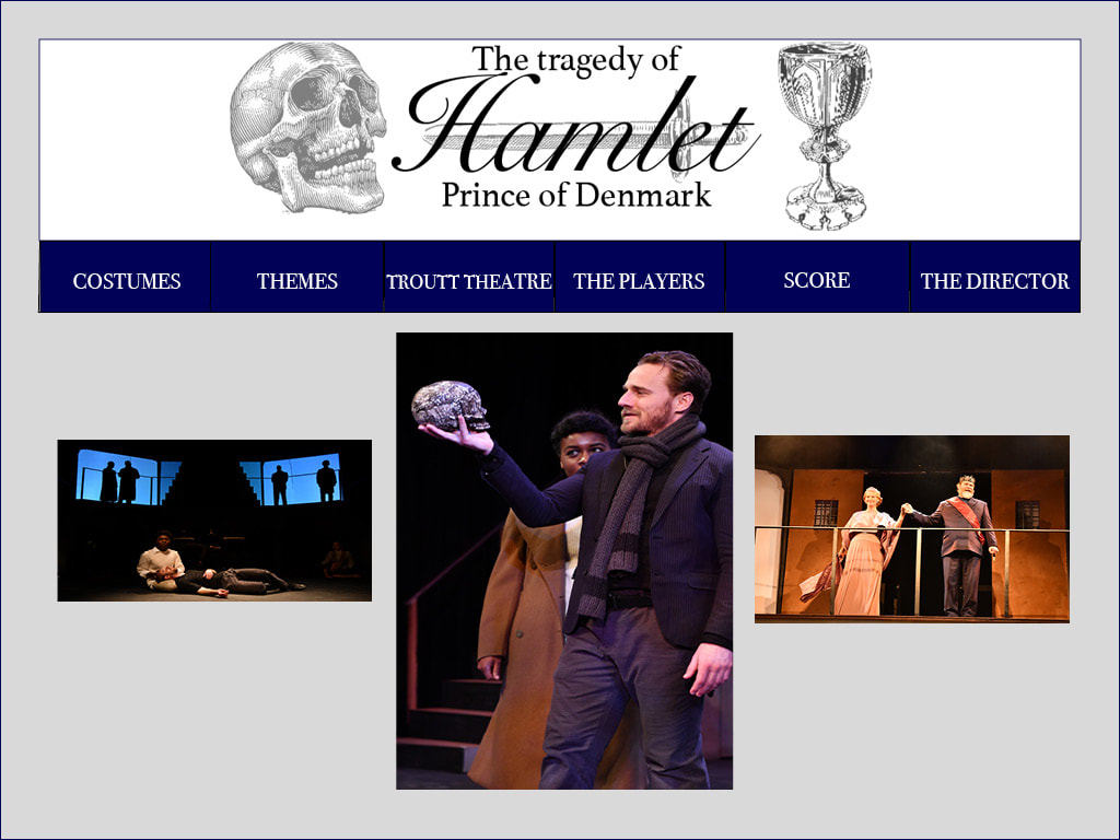 Designing a website seemed to be a very daunting task initially. But, like all daunting tasks, I took it one part at a time and I was able to accomplish something that before this class I believed was nearly impossible. Building this website was challenging, rewarding, and occasionally even fun. The Technical I decided to build my website entirely from scratch. I took what I learned from building the tutorial and ran with that. I started out knowing the general idea of how I wanted each of my pages to look and if I came across an element that I wasn’t quite sure how to create, I would either look up how to do it on google or I would ask others in the class how they were able to complete the task. I found that getting help from other classmates was crucial not just in the technical side of things but also in getting their opinion on some design choices I had made. One specific technical challenge that I faced was getting my pictures to be the correct size and making sure that they were in the area that I wanted them to be. This was my biggest struggle in the whole process. The Ideal Website If I knew more about coding than I do right now, my website would definitely look different. It would look more professional and would have more aspects to it than just words and pictures. I would have liked to include more graphics in it that were designed in Photoshop. Ideally, my website would have been able to include some videos that I have made and highlighted different aspects of myself that I think future employers might be interested to see. Unfortunately, I feel as though my website looks a little bit on the juvenile side. I feel that my color scheme was childish and slightly basic. It doesn’t exactly match how I feel I am as an individual and as a person striving for a job in the entertainment industry. One page that really frustrated me was my reading page. I couldn't ever get it to space out quite how I wanted and in the end, it just looked shoddy and didn't really become the creative masterpiece that I was hoping for. The Modes I attempted to use all modes of communication on my website though I don’t feel that I was quite able to utilize the gestural mode. Linguistic: Specifically, when creating my “About Abigail” page, I attempted to use words that conveyed who I was to someone who maybe had never met me before. I tried to throw in some humor and spoke clearly about my ambitions in life. Also, when designing my navigation bar, I tried to use interesting or eye-catching words and phrases that would make visitors to the website be more interested and want to click on the internal links. Visual: Visually, I used pictures and brighter colors to make my website more appealing. I also tried to stick to a color scheme that was similar to the main picture that I used on my home page of the donut. I added in a gif on one of my pages to liven it up and make it more dynamic. Aural: Though I found it a bit hard to include sound on my website I was able to embed some albums from Spotify on my listening page. This helped to create an interesting dynamic that allowed visitors to get a taste of what music has filled my day to day life. Spatial: I tried to space my website out in a way that wasn’t overwhelming or complicated. I was able to separate different topics onto different pages and none of the pages had too much information as to where it would be stressful or confusing for a potential visitor. Design Strategies One specific design strategy that I used was color. I intentionally used brighter colors such as pinks and whites with black text. In doing this I hoped to convey my light and happy spirit to a potential visitor. I placed lots of emphasis on most of my pictures by making them the larger portions of my website. I personally have a great love for taking pictures, so I made sure to include many of those on my website. I attempted to keep most of my information in a close proximity to each other so that it would be easy to find information and visitors would not have to go searching for it when necessary. Conclusion In the end, I was proud of myself for sticking with the site I designed because there were many moments where I felt like just scrapping the whole project and starting over again. Because I am a creative perfectionist, I know that if I didn't have a deadline I would never finish the project and I would constantly be wanting to change things. So even though my website did not turn out exactly as I wanted it to, I am still proud of it and I am happy that I was able to learn a new skill because of it.
Many choices go into designing a website and those choices can be based on the reasons for creating such a website. When companies or creators need to make a website there are a few things that need to be considered before beginning. These concepts can be classified as the rhetoric of the website. I have chosen to analyze the rhetoric and design choices of the Shakespeare’s Globe Theatre website for their Globe to Globe Hamlet project. Rhetoric Upon first viewing the website, it is easy to gather who the audience is: those hoping to find out more information about the world tour of Hamlet that is happening. The audience might also include those wishing to see a schedule of the performances or even those wishing to donate to the foundation. The purpose of this website is to not only promote the Globe to Globe tour but also to archive the project as a whole. On the website, there are links to different social media that have captured the show and the touring process in general. The goal of the website is to provide information, updates, media, and an open place for people who enjoy Hamlet and hope to learn more about the global tour that the Globe to Globe foundation is attempting to produce. The context for this website is the time surrounding the Hamlet world tour that occurred over the course of two years. Design Choices A very nice contrast has been created on the website due to the two main color schemes used: reds and neutrals. These colors help to create a contrast between the background of the website and the main focus. The red colors are most prevalent on areas of the main page that a visitor could click on and follow to another area of the website such as the ‘about’ page. This contrast helps to draw the reader’s eyes around the page in order for the most important information to stick out. The website has a very neat organization. All of the widgets on the navigation bar are labeled and are helpful to audiences for quick access to certain parts of the page. The use of the globe graphics on the main page adds a nice touch as it allows the website to showcase all of the different countries that Hamlet will be touring in. It is very dynamic because it combines images of different cultures and showcases how their production of the great Shakespeare play ties into these different areas of the globe. The Archive as a Whole The archive is a very professional collection of the world tour of Hamlet. It organizes the schedule well and provides updates regularly to fans and supports of the Globe Theatre. One particular aspect of the website that I found stunning was the interactive map of the tour. I have added a picture of this graphic for reference. The map allows you to click on certain regions of the world and get a short synopsis of the tour details and even details on the theatre in that region that Hamlet was performed in. I feel that it would be beneficial to our digital archive if we were to create an interactive graphic such as this one to help our audience get a deeper understanding of our purpose for the archive. Overall, the Shakespeare’s Globe trust did a beautiful job of archiving their world tour of one of William Shakespeare’s greatest plays, Hamlet. If you would like to explore the website yourself, click on this link: http://globetoglobe.shakespearesglobe.com 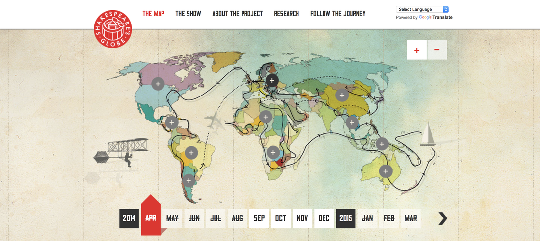 Whether we know it or not, we are constantly making lists online. Lists of our thoughts, our favorite songs, and pictures of our favorite moments all help to create our digital presence. These lists can be considered a sort of digital archive. Personally, some of my favorite archives come from my social media. Instagram and Twitter have played a big role in developing my online presence. My Instagram spells out some of my favorite memories ever since I was 14 years old. I love pictures and having a place to compile all of my favorite memories and share those memories with other people makes me feel so much more connected not only to my own history but also to the history of others. My twitter, on the other hand, is a constant stream of my own inner musings. It is filled with thoughts that have come to me, funny things that I have heard other people say, and even some media that I find amusing or intriguing. On Twitter, I can find news, pop culture concepts, and even some novel ideas. Twitter is an interesting platform because people are generally allowed to say whatever they want which can be dangerous. In a strange way, Twitter is a small book of my life. My twitter followers have read about awkward interactions that I have endured, the time that my parents decided to renovate a house by themselves, and have seen an abundance of pictures of my dog and other peoples dogs. One aspect of Twitter that is particularly interesting is when users may agree with each other on certain thoughts. When this occurs, users are able to retweet the original tweet and post it onto their own timeline of tweets. So not only can a persons twitter showcase their own original thoughts, they can also have traces of other peoples influences in their lives. Another type of digital archive that I somewhat unconsciously create is my music playlists. I prefer Apple Music over Spotify but that is just a personal preference. My playlists are something that I can spend anywhere from five minutes to five years creating. I am constantly adding songs to old playlists, making new playlists, and even downloading playlists that others have created. Music is such a large part of my life and it has the ability to speak to me at any moment of my life. I have playlists for when I am happy and when I am not so happy. I make playlists for studying, parties, workouts, and even for road trips. I have attached an image of a playlist I made at the beginning of this summer of songs that I felt fit the mood of this summer. Prior to this project, I didn’t really feel as though my playlists counted as a kind of “digital archive” but thinking about it now, my taste in music is something that shapes my presence online especially with the social aspect that was brought about due to streaming platforms such as Apple Music and Spotify. While being able to have a presence online through my social media and streaming platforms is exciting and interesting, it can also be slightly nerve-racking. To know that anyone could come about and see my Instagram posts and know where I go to school and where I grew up puts me at ease. I do have the ability to go through and see who is following me and I am able to block specific people if I do not know them but it is very easy for people to see my information because it is online in an easily accessible medium. Our digital curations are what define us and make up a majority of our online presence. Whether we like it or not, our digital footprint is constantly growing with every tweet, post, and song added to our playlists. 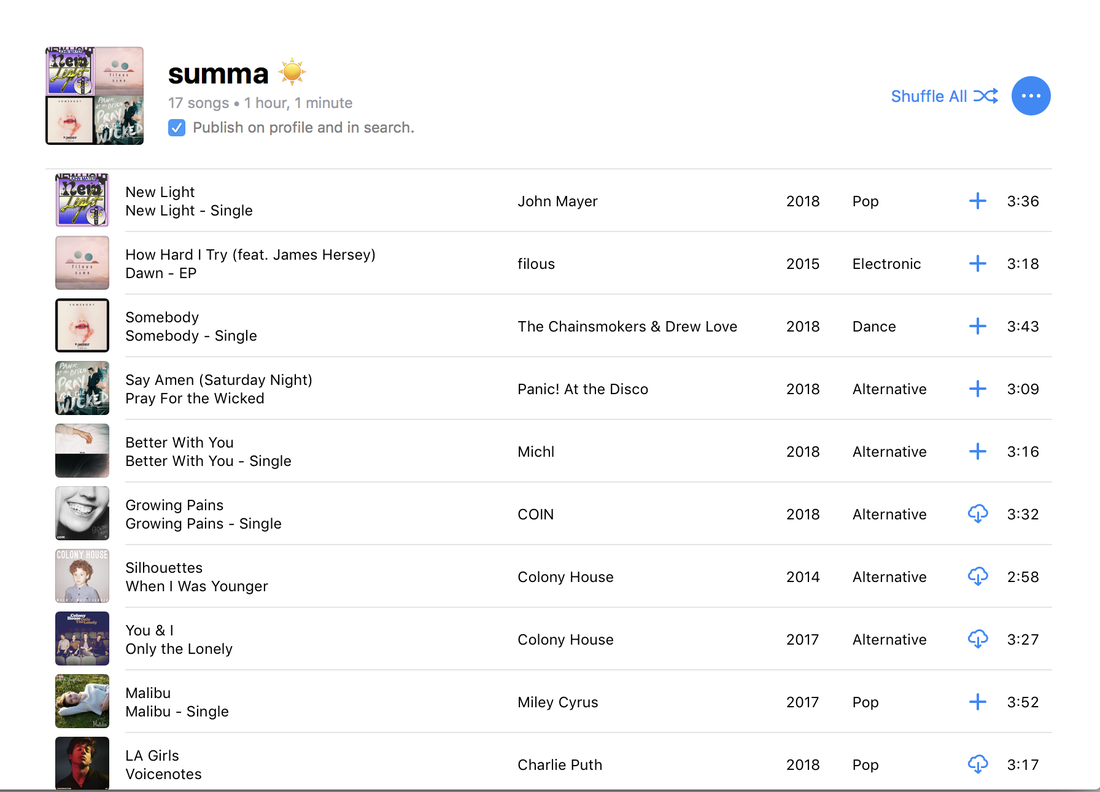 |
AuthorI am a Freshman Multimedia Production major. ArchivesCategories |
||
 RSS Feed
