I'm Abigail. This is my blog for Digital Literacies.
|
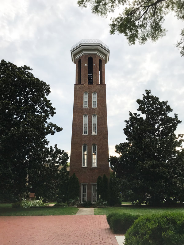
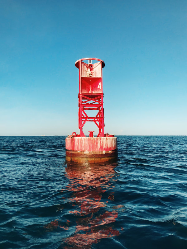
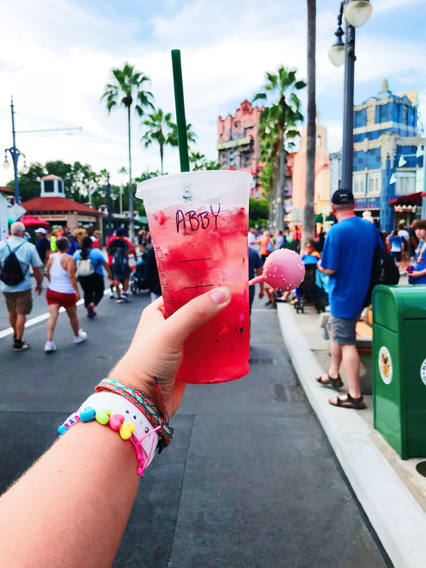
Designing a website seemed to be a very daunting task initially. But, like all daunting tasks, I took it one part at a time and I was able to accomplish something that before this class I believed was nearly impossible. Building this website was challenging, rewarding, and occasionally even fun. The Technical I decided to build my website entirely from scratch. I took what I learned from building the tutorial and ran with that. I started out knowing the general idea of how I wanted each of my pages to look and if I came across an element that I wasn’t quite sure how to create, I would either look up how to do it on google or I would ask others in the class how they were able to complete the task. I found that getting help from other classmates was crucial not just in the technical side of things but also in getting their opinion on some design choices I had made. One specific technical challenge that I faced was getting my pictures to be the correct size and making sure that they were in the area that I wanted them to be. This was my biggest struggle in the whole process. The Ideal Website If I knew more about coding than I do right now, my website would definitely look different. It would look more professional and would have more aspects to it than just words and pictures. I would have liked to include more graphics in it that were designed in Photoshop. Ideally, my website would have been able to include some videos that I have made and highlighted different aspects of myself that I think future employers might be interested to see. Unfortunately, I feel as though my website looks a little bit on the juvenile side. I feel that my color scheme was childish and slightly basic. It doesn’t exactly match how I feel I am as an individual and as a person striving for a job in the entertainment industry. One page that really frustrated me was my reading page. I couldn't ever get it to space out quite how I wanted and in the end, it just looked shoddy and didn't really become the creative masterpiece that I was hoping for. The Modes I attempted to use all modes of communication on my website though I don’t feel that I was quite able to utilize the gestural mode. Linguistic: Specifically, when creating my “About Abigail” page, I attempted to use words that conveyed who I was to someone who maybe had never met me before. I tried to throw in some humor and spoke clearly about my ambitions in life. Also, when designing my navigation bar, I tried to use interesting or eye-catching words and phrases that would make visitors to the website be more interested and want to click on the internal links. Visual: Visually, I used pictures and brighter colors to make my website more appealing. I also tried to stick to a color scheme that was similar to the main picture that I used on my home page of the donut. I added in a gif on one of my pages to liven it up and make it more dynamic. Aural: Though I found it a bit hard to include sound on my website I was able to embed some albums from Spotify on my listening page. This helped to create an interesting dynamic that allowed visitors to get a taste of what music has filled my day to day life. Spatial: I tried to space my website out in a way that wasn’t overwhelming or complicated. I was able to separate different topics onto different pages and none of the pages had too much information as to where it would be stressful or confusing for a potential visitor. Design Strategies One specific design strategy that I used was color. I intentionally used brighter colors such as pinks and whites with black text. In doing this I hoped to convey my light and happy spirit to a potential visitor. I placed lots of emphasis on most of my pictures by making them the larger portions of my website. I personally have a great love for taking pictures, so I made sure to include many of those on my website. I attempted to keep most of my information in a close proximity to each other so that it would be easy to find information and visitors would not have to go searching for it when necessary. Conclusion In the end, I was proud of myself for sticking with the site I designed because there were many moments where I felt like just scrapping the whole project and starting over again. Because I am a creative perfectionist, I know that if I didn't have a deadline I would never finish the project and I would constantly be wanting to change things. So even though my website did not turn out exactly as I wanted it to, I am still proud of it and I am happy that I was able to learn a new skill because of it.
0 Comments
Leave a Reply. |
AuthorI am a Freshman Multimedia Production major. ArchivesCategories |
||
 RSS Feed
